Today I have special guest, romance author Lynn Hubbard on the blog talking about cover art. As you may know, I love book covers. If done right they can tell you so much about what you'll find inside, and hopefully make you think what you'll find inside will be AWESOME.
Take it away, Lynn!
- Sairz
The Cover is the most important aspect of the book. I don’t care how amazing your story is if you have a drab cover, it’s a hard sell. The cover is the first thing people see. You have maybe a second of their time for them to make a decision and click on your book.
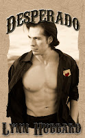
It took me awhile to come to grips with that. For example my book Desperado. I originally had it published under a different name, “The Hand You’re Dealt” and a different cover. My sales were down so after consulting with family and friends I was told the title was depressing. The original cover which I LOVED had two people on horses staring into each other’s eyes. I saw a man and a woman. Others saw two men. Since it is a romance book I decided to put a hot guy on the cover. Where o where was I gonna find a hot guy? I turned to the internet. And so my quest began.
The vision of the new cover that popped into my head was of a handsome dark headed man with the queen of hearts tucked into his pocket. So after searching through thousands of pictures of muscular men online I finally came across Julian Fantechi. He was perfect. Moreover, he was on facebook so I sent him a message. The next day I awoke to find several very hot pictures of Julian in my email box. Picking my favorite, I had my son design a card and tuck it into his pocket to keep the original poker theme going.
Below is the Original Cover and my Current Cover.
I also changed my Young Adult book. The original cover was perfect. I LOVED it, it had a rustic feel with a bridge that perfectly expressed Joanie’s neighborhood and the feel of the book. And I loved the title. “Things Change.” But apparently no one else did. So a little bit of my soul died and I changed the name, and I changed the cover. And people bought it. And people liked it. And I grew to like it as well.
My Third book was much easier. I again spent countless hours searching for the right guy for the cover. (Its hard work but someone has to do it!) Then there he was. Jeandre. This one was perfect from the start. I cropped him out and slapped him on a pic from my Vegas trip. Perfection. Now the cover is as hot as the inside!
My current project Chase the Moon is a sequel to Run into the Wind. I again went with Julian from my Desperado Cover. For my Chase the Moon Cover I wanted it monochromatic blue. I found a wonderful pic of Julian on the beach and matched it to a lake setting. An amazing graphic artist named Tamara made it come to life. Even though technically Chase is a western the cover does not scream Old West. But it does scream PICK ME UP! Which is what we are all aiming for!~Lynn Hubbard
Chase the Moon: Coming October 2011
Desperado is .99 cents for a limited time on Nook, Kindle or Smashwords!


This is definitely true and I can really identify with Lynn. I had some great old world shots of statues I had photographed myself at the Versailles Chateau and had chosen several as covers for The Beautiful People series. I didn't sell one copy.
ReplyDeleteI sexed up the covers and all the sudden, people buy. Same story, just different covers. I suppose I should be offended as sometimes people think the novels are erotica (I guess I sexed up the covers a bit too much) but there is a story there and someone likes it as the series continues to sell. Thank you for sharing your journey with us, Lynn.
Whatever sells the book and IS reflective of the content, am I right? If the cover has nothing to do with the content then that's a problem though. :) Thanks for commenting, Dani!
ReplyDelete